Introducing Dutch Fields
Location: Midway, Utah
Home Specifications: 7 bedrooms, 8 bathrooms, approximately 7,000 sq.ft.
Designed by: Marianne Brown, Katie Holloman, Georgia Barnes
Styled by: Marcie Busath
Builder: Jackson & Leroy
Photography by Lucy Call unless specified.
As 2020 comes to a close, we wanted to share one of our favorite projects from this year, Dutch Fields. This project was the culmination of more than two years of work, so seeing it all come together this year has been incredibly rewarding.
In 2018, our client came to us with the dream of building a home and an accompanying barn for their large family. They were inspired by traditional design, with the added fun of vintage-inspired colorful wallpaper and fabric patterns.
Today we wanted to share our favorite features from the home. We’ll be sharing a few details from the barn on the blog next week, so keep an eye out for that!
The Entryway
With a large chandelier, a comfy place to remove your shoes, and plenty of natural light, the entryway sets the stage for this home. The console is a favorite of our team, and it pairs well with the carved wood mirror and original art.
The Kitchen
From the entryway, we move into the kitchen, which offers a variety of delightful details. The main feature of the space is a beautiful Lacanche range, which is complemented by marble countertops along with a marble backsplash. Most of the custom cabinetry is closed off, with a small section of open shelving to showcase special pieces. Finally, a larder provides handy storage for bread, appliances, spices, and cooking supplies.
The Dining Room
Without fully closing off the dining room, the window-paneled transom and addition of the dark blue paint allow for the space to feel separate from the kitchen. As is the case throughout the home, natural light is prioritized, and plenty of windows make the room feel light and airy.
The Living Room
The living room is one of the spaces where the traditional finishes truly shine. The stately fireplace commands our attention, but the chandelier, vintage-inspired furniture, and subtle patterns on the window coverings and sofa create a layered, welcoming space.
Office
This office is one of our favorite rooms ever. We love everything about it, from the wallpapered ceiling and lovely chandelier to the window seats and custom shelving. It’s the perfect place to get lost in a book or get some writing done.
Primary Bedroom
For this bedroom, our team worked to keep the space simple, to let the custom millwork and fireplace shine. Paired with a vintage dresser and our client’s family art, this space is designed to be an oasis.
primary bath
Our team loves to create spaces that are both beautiful and practical. Although they may look like only mirrors, the above-sink mirrors double as medicine cabinets. With plenty of storage, vintage-inspired tile, and a deep soaking tub, this primary bath is extremely practical while also feeling luxurious.
young boys room
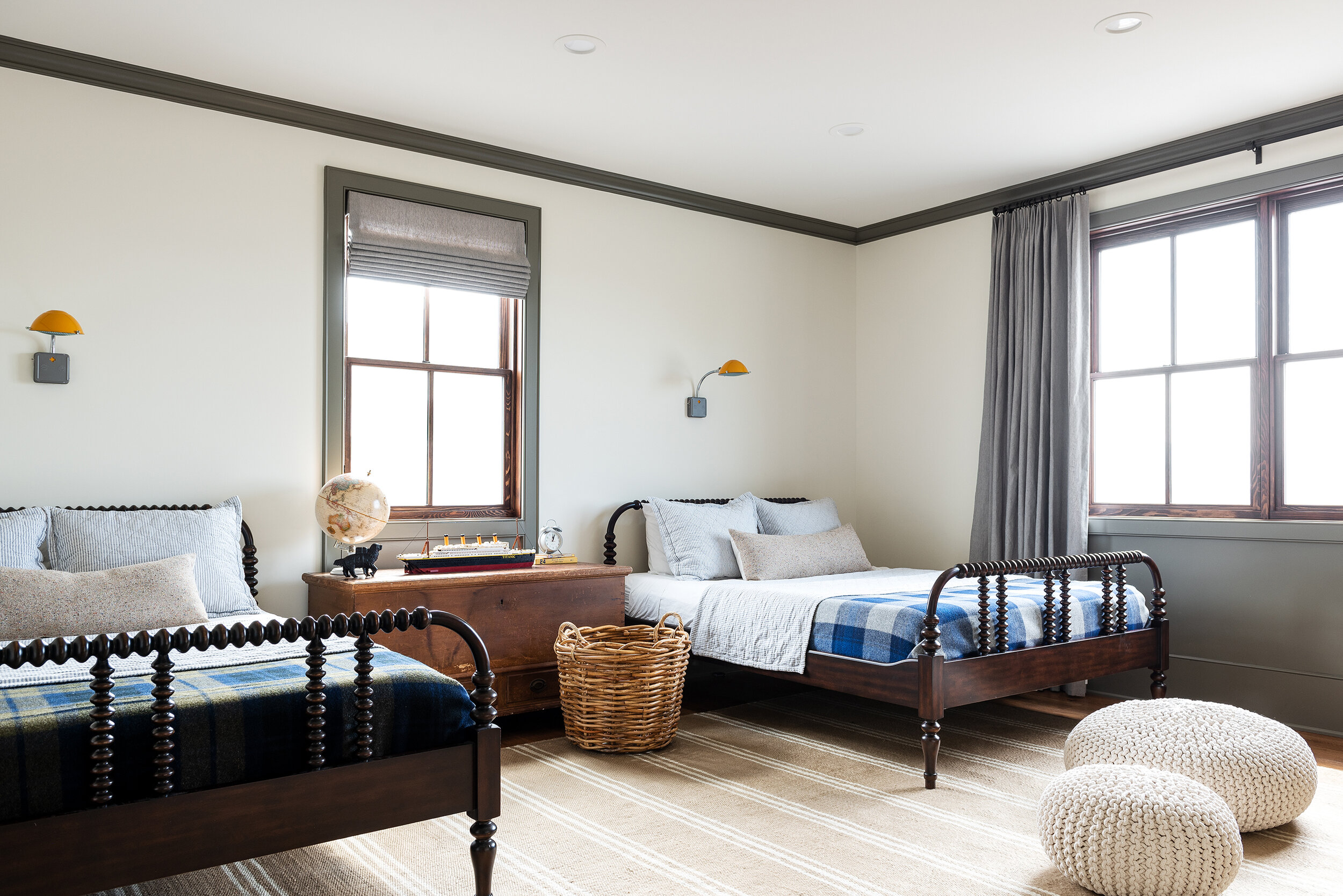
The bedroom for the two youngest boys balances design with fun details for kids to enjoy. There’s space for anything a little boy needs, including room to play, a place to keep their backpacks, and a cozy place to curl up at night.
older boy’s room
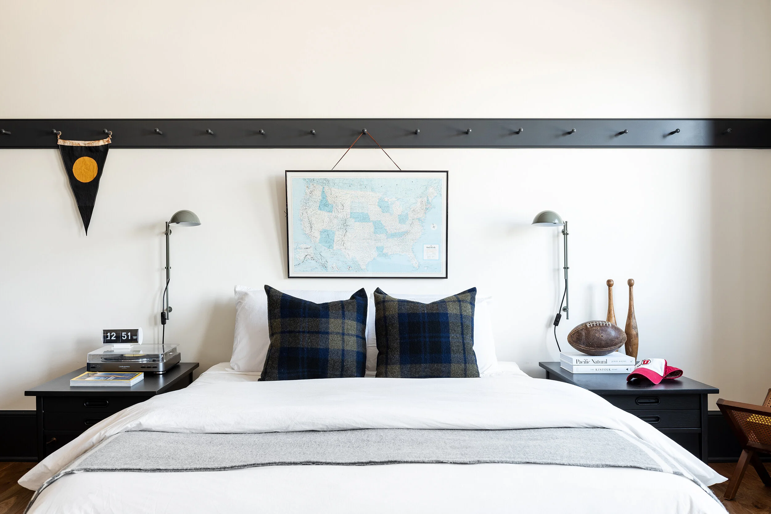
This room is another one of our all-time favorites. With space for lounging, studying, and sleeping, this room is a haven for a teen boy.
girl’s room
This is one of the spaces in the home where color and fun wallpaper were showcased. We love a room with space for all of our client’s treasures.
mudroom
The Butler’s Pantry
Butler’s pantry images by Emily Bade.
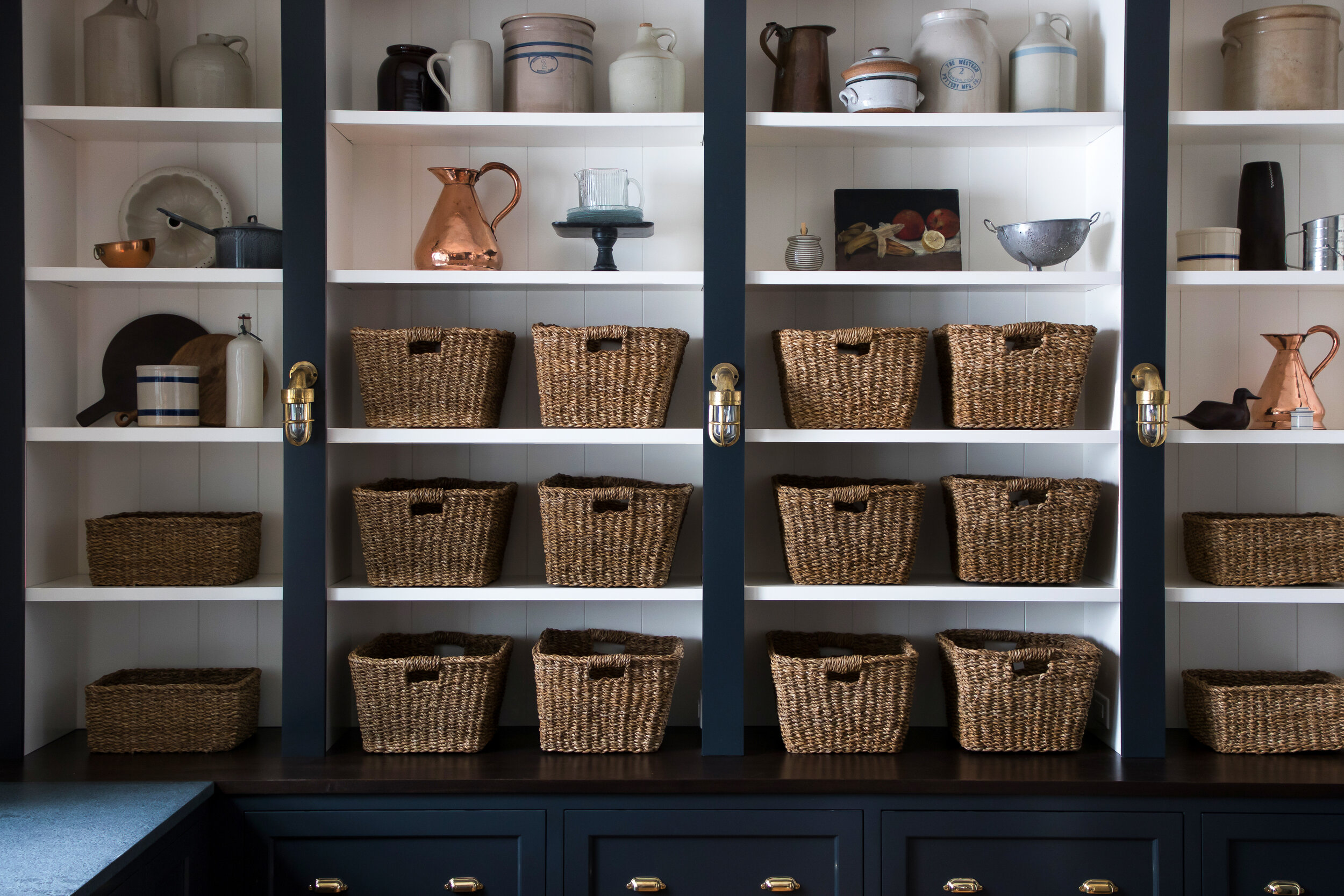
Just off the kitchen, the butler’s pantry provides extra space for kitchen prep and messes. Our client’s family is large, so we included plenty of space to keep snacks and other foodstuffs with a full wall of shelving. This space is a balance of dark and light, with dark blue paint and soapstone countertops. With so many dark features, the eye is immediately drawn to the luminous copper sink.


